Today's postings
- [Baren 41502] Re: Queering the Colors (Robert Arnold)
- [Baren 41503] Re: Baren Summit 2011, San Antonio (Diane Cutter)
- [Baren 41504] Baren Member blogs: Update Notification (Blog Manager)

Message 1
From: Robert Arnold
Date: Tue, 22 Jun 2010 14:01:43 GMT
Subject: [Baren 41502] Re: Queering the Colors
Send Message: To this poster
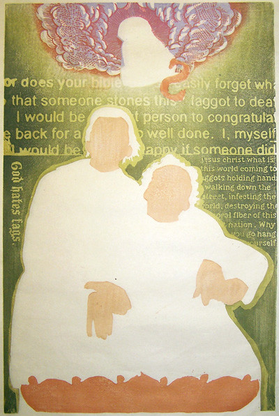
queer paper? Are linocuts queer when compared to woodcuts? I like a
lot of your work and I don't really care if you or anyone else is
queer. I am not so naive to think that there are not people out there
that would consider a persons choice of a partner/wife/husband when
viewing thier work. I understand that all of the parts of our lives
influence our work but in my opinion you either produce good work or
you don't. How you get to that final product is your own personal
journey. If someone wants to know about this then they will ask. I
know there will be some people who will say they want to know and that
is fine and I have no objection, after all if I am offended by
something I see on Baren I can always stop receiving it. This is
something that has always irritated me about art , TV, radio, the
movies and books. If you do not like something don't look at it,
listen to it or read it. I guess my main question is why did you feel
the need to discuss your color choices in the context of queer vs.
manly. I am asking this question out of genuine interest with no
intent to offend or accuse anyone.
Robert Arnold
The Dog House Press

Message 2
From: Diane Cutter
Date: Tue, 22 Jun 2010 16:41:24 GMT
Subject: [Baren 41503] Re: Baren Summit 2011, San Antonio
Send Message: To this poster
We will be traveling from New Mexico to Florida later this summer and would love to stop by to see your place. I'll contact you off Baren once we get closer to that time. I'd love to see your printmaking lab and catch up since the last Summit.
Diane
www.DianeCutter.com
www.theitinerantartist.blogspot.com
www.DCutter.etsy.com
Digest Appendix
Postings made on [Baren] members' blogs
over the past 24 hours ...
Subject: More Progress
Posted by: Annie B
This item is taken from the blog Woodblock Dreams.
'Reply' to Baren about this item.
Subject: More Progress on the Geographical Divides
Posted by: Maria
|
Please see http://geographicaldivides.blogspot.com/ for all the other prints and artists. My topo/puzzle idea came to life when I received Lynn's puzzle pieces. We had talked about keeping the individual images simple and I was pleased with her choice of imagery. Lynn will be pleased to know that the rat transplant went without a hitch (perhaps she can further explain that one!). Just to refresh, we had gone with the theme urban/rural and how somehow we work things out with natural things when we live on the edge of a city (as Lynn does) or smack in the middle but with an acre of desert "elbow-room" as I do. On a bigger scale, of course, every city in Nevada deals with the issue of sprawling into the habitat of the few and hardy creatures with whom we share our beloved desert. In any case, with Lynn's images in place, I started sketching in PhotoShop again. I wanted to keep the topo colors and somehow bring out the positive concept of sharing among urban/rural, rather than some of the more negative connotations that come to mind. I decided to add some urban elements since Lynn's critters pretty much took care of the rural part, and after some mulling and browsing, settled on semaphores (traffic lights for US folk :-). The "traffic lights" I picked had a hint of primitive symbols and, rendered in the topo colors, blend in quite nicely without losing meaning. Caution and courtesy, please, when urban and rural meet... The computer is really a luxury when it comes to "sketching" and I don't use it often enough to develop my imagery. When I do, I find it most exciting to change imagery, save stages, tweak elements of design here and there, change color schemes...luxury! I even changed the "paper" several times to see what the image would look like printed on various choices. Here is the almost-to-be-final image. I need to let it gel for a couple of days and then it should only be about another week or two for carving and printing. My Valley of Fire show concludes next week and I should be able to dedicate myself to this project fully and finish printing by the second week of . . . [Long item has been trimmed at this point. The full blog entry can be viewed here] |
This item is taken from the blog 1000 Woodcuts Updates.
'Reply' to Baren about this item.
Subject: I Used To Skate & Sleep
This item is taken from the blog Against the grain.
'Reply' to Baren about this item.

