Today's postings
- [Baren 41497] White Line & Regular ("Dan Dew")
- [Baren 41498] Re: White Line & Regular (ArtfulCarol # aol.com)
- [Baren 41499] Re: White Line & Regular ("Ramsey Household")
- [Baren 41500] Re: White Line & Regular (Viza Arlington)
- [Baren 41501] Baren Member blogs: Update Notification (Blog Manager)

Message 1
From: "Dan Dew"
Date: Mon, 21 Jun 2010 23:43:38 GMT
Subject: [Baren 41497] White Line & Regular
Send Message: To this poster
My next block has so many areas where it is just beggibg to be carved as a white line.
But other areas are begging for a regular reliefcut.
Can they be combined on one block, white line and relief?
D.Dew

Message 2
From: ArtfulCarol # aol.com
Date: Tue, 22 Jun 2010 01:14:28 GMT
Subject: [Baren 41498] Re: White Line & Regular
Send Message: To this poster
adds interest .
Carol Lyons
In a message dated 6/21/2010 7:43:41 P.M. Eastern Daylight Time,

Message 3
From: "Ramsey Household"
Date: Tue, 22 Jun 2010 04:13:16 GMT
Subject: [Baren 41499] Re: White Line & Regular
Send Message: To this poster
I do it all the time.
Carolyn

Message 4
From: Viza Arlington
Date: Tue, 22 Jun 2010 06:10:37 GMT
Subject: [Baren 41500] Re: White Line & Regular
Send Message: To this poster
viza
Digest Appendix
Postings made on [Baren] members' blogs
over the past 24 hours ...
Subject: Queering the Colors
Posted by: Annie B
|
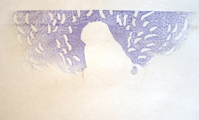
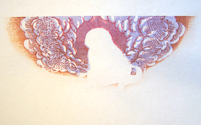
The first thing I wanted to do with this re-working of the John Alexander and Thomas Roberts print was to "queer" the colors. A friend on Flickr commented that she thought the red (pink) and blue I used on the first version spoke of gender, which I can see. But to me it read as all-American, red white and blue. It made me think about what "queer" colors would be. I used to be assistant art director at a weekly magazine called PC Week and the editors there consistently vetoed any graphics that didn't use "business colors." Business colors consisted of dark to medium blues, dark or teal greens, deep indigo, and reds if they were deep and cranberry. All pastels were refused as were lavender, orange, pink and yellowish greens. To me the term "business colors" was always code for "manly colors" and I figured that pastels, lavender, orange, pink and yellowish greens were "queer colors." So I'm going queer with these colors. I started with a lavender tinted blue under the cloud:  Added some pink and orange:  And then laid down a yellow-green background: [Long item has been trimmed at this point. The full blog entry can be viewed here] |
This item is taken from the blog Woodblock Dreams.
'Reply' to Baren about this item.