Today's postings
- [Baren 38530] Viewing of Baren 911 Collection (ArtfulCarol # aol.com)
- [Baren 38531] Baren Member blogs: Update Notification (Blog Manager)

Message 1
From: ArtfulCarol # aol.com
Date: Sat, 28 Mar 2009 14:36:46 GMT
Subject: [Baren 38530] Viewing of Baren 911 Collection
Send Message: To this poster
People have been asking me where they can view the collection of our Baren
woodblock prints that are in the virtual gallery of the National September 11
Memorial & Museum.
Click on each image to read each artist's statement.
_http://registry.national911memorial.org/view_artist.php?aid=187_
(http://registry.national911memorial.org/view_artist.php?aid=187)
Carol Lyons
Irvington, NY
Digest Appendix
Postings made on [Baren] members' blogs
over the past 24 hours ...
Subject: You shall have your Proof!
Posted by: Pistoles Press
|
I cracked up at Diana Moll's comment on my last post. She spurred me on to finish the block and pull a proof before I called it a night! The proof is definitely a proof. I purchased some burgandy/wine colored paper for the book covers but the gold dust is still the shade that I will be using. This chinese red color is just a piece I had laying around. The color is okay but way too obvious for me. I didn't want to use a bright red because the chinese dragons would imply a "chinese restaurant feel" to me. It's definitely firey! Here is the block locked up on the press bed ready for a slathering of ink. I couldn't decide whether or not to use a tinted ink or just tint base. I have decided for the books to just go with tint base. The colored paper is so dark that it will not be necessary to use any of my pigments for a "back up color". [Long item has been trimmed at this point. The full blog entry can be viewed here] |
This item is taken from the blog Pistoles Press.
'Reply' to Baren about this item.
Subject: Psalm 10
Posted by: Daniel L. Dew
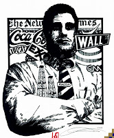
 This Psalm came to me quite easily actually. Once I read through the Psalm, the idea and imagery just popped into my head and off I went. The model is actually an attorney that worked in the same building as I did. A very nice guy and a good person, but I knew I could draw out the "tone" I was looking for, but it took a lot of photos to finally get him annoyed enough to get the expression I needed. The background imagery fit well, but looking back with the current events I could have probably thrown in more financial institutions other than just the street sign. Here is the final image:  As you can see, I made some changes on the final image. I changed the oil rigs from the drawing, I felt like it was too much in the middle and distracted from "flow". It also gave me the chance to include the Psalm title, by making it into a tie clip. Once again, I really tried to "weight" the lines, by carving some thick and some thin. I think it helps to give me a "gray" somewhat. O.K., here are the decorative inital and illumination. The scan is not the greatest, as the tan is actually gold and the green is more of a warm color. [Long item has been trimmed at this point. The full blog entry can be viewed here] |
This item is taken from the blog A Psalm Quest.
'Reply' to Baren about this item.