 |
Julio Rodriguez
|
|
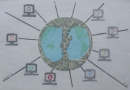
Artist's comments ... Very early on after the Print Exchange was announced I came up with this idea for my entry. Although minor changes came about and certain design ideas eluded me (lack of technical experience), the main central theme of a "Baren world" always played a key part in my print.
The print shows the world as a baren tool and is symbolic of how far the [Baren] Forum has grown and its outreach to all printmakers and all continents. Another perspective is that of the "printmaking world" being engulfed by the baren cover. The strength of the baren knot connecting the oceans is indicative of the unity and respect shared at [Baren] between our members (east & west, traditional & modern, oil & water, baren & presses and most important beginners & professionals). The paper was intentionally left untrimmed at the top and left edges of the print to again symbolize the diversity within our group. No background color was used in order to highlight the traditional Japanese papers. The PC's surrounding the "Baren" world are of course, us, the members. Each alike in our love for printmaking and yet each so colorful and different.
The print was created using eight "blocks" of 1/4 inch birch stock (not plywood). Watercolors and Speedball Water Inks were used for pigments. The Japanese handmade paper was bought at Aiko's (Chicago) and is-called Fuji Natural, sized (#249). A student grade baren (bamboo sheath) was used for printing. Some blocks required two impressions.
I hope you enjoy my print as I am sure I will enjoy yours. It has being a great first year at [Baren] and I have enjoyed "meeting" all of you and will always cherish our discussions as well as our family disagreements.
Thanks James Mundie for the effort and the patience to organize this print exchange and thanks to Dave Bull for making [Baren] a reality....
[Baren] members critiques:
Positive points ... Great idea, really shows up your dedicated interest in the Baren forum. Has a sort of innocence and freshness in its directness that is very appealing!
Room for improvement... Technically it shows that you are just beginning to learn hanga, too much water overall makes the color washed out. A heavier paper would make it easier to print; bet it was pretty saturated when you were working. I can see fibers coming up from rubbing the delicate wet paper. Also it must have been hard to print the black lines without having the paper dip down into the low areas... I'm not sure how you avoided this pitfall, but stiffer paper would help.
General comments on the print ... I like the way the idea is just as screwy as Baren is generally: unexpected combination of baren and computers. Such goodwill behind it! And I know what a struggle it is to print, so I am very impressed, knowing that you learned mostly over the internet (am I right here?)
Positive points ... The rendition of the baren is very baren-like. The plan to have a circular instead of a classic composition is very creative and intriguing. The concept of baren world-wide is well-expressed by the globe inside the baren. Also I thought that it showed a lot of sensitivity to attempt a print commemorating the subject matter and content of the baren exchange itself. It is a great visual commemoration.
Room for improvement... The artist could find some visual device besides radiating spokes to connect the individual barens. This visual device may not be necessary at all, because the idea behind the picture is so clear. It would have been a more complete print with perhaps a textured or cohesive background to the baby barens. I'm not the greatest critic in the world either, so take all this with a grain of salt.
General comments on the print ... As I stated above, I was very glad that someone commented visually on the international phenomenon of Baren.
Positive points ... I like the textured look of the baren and the world map beneath it. I like the meaning implied in the design.
Room for improvement... Usually when I see lines go out from a central point in every direction I feel like I'm looking at something like a wheel (also I believe this is an indication of chaos, but I don't know why; it's something I have seen in books on composition. I like the idea of a mandala, except here I feel the spokes of the wheel are too important (maybe it's that chaos thing?) and I feel I'm being drawn away to the outside of the image. So looking at it bothers me a little because I'm not being held within the image. The red screen wants me to look at it the most, and I don't know if it deserves my attention that much. Yet, without the red, I'm sure the other colors would seem bland. Maybe several of the colors within the screens would look nice in attention grabbing hues? If it's to have a mandala feeling, then it should be very balanced I think.
General comments on the print ... For me I can't say much about the technique because I don't do water based prints.
Positive points ... I find the strongest part of the print is the central baren/globe image. The cutting of the grey block over the yellow is interesting and indicates nicely the bamboo sheath. The idea has a nice ripeness to it - the globe enclosed by a baren sheath.
Room for improvement... I think we sometimes overload a single image with ideas. I like to zero in on a fairly simple idea and then work hard to make the details support it rather than restate it. IMHO I don't find the print improved by the little computers. It took me several seconds to realize that the little colored things on the screens were barens. The computers are all the same and don't convey for me the variety of approach and personality of the people they are intended (?) to represent. The central image would have been strong enough to carry the idea without them.
It appears to me that you had some difficulty planning the color overlaps. The transparency of the medium worked for you in some places (the baren cover) but in others against you - I am thinking of the ends of the little lines showing through the edges of the large baren. Sometimes it is good to change the details of the composition to fix this kind of thing. If the black lines had stopped a quarter inch or so away - the idea of connection would not have been lost and you would have much less chance of overlap and show through.
General comments on the print ... It is very difficult to critique without dialogue - even with dialogue it can be very touchy. Your print is clear and direct. It is the only one in the portfolio that took on the challenge of portraying [Baren] itself. The translation of that into a visual metaphor was in general successful.
Positive points ... The "baren world" is deftly done and smack-dab placement of that element is very good. Clever use of color is used with individual barens on the computer screens.
Room for improvement... Although I understand what you did, perhaps you tried to say too much by including the individual computers. Leaving them out might result in a more simple and elegant statement.
General comments on the print ... Good work, Julio!
Positive points ... Overall, Julio I think this print is wonderful in that is about [Baren] itself, and has been cleverly designed to give a poetic notion of just what this whole forum and the exchange in particular is about. Your print is a sort of mascot for us.
Room for improvement... As I recall, you expressed some difficulties you were having getting the colors on the globe to read clearly in the later impressions. To my eye, the problem was that the colors were too close in chrome and hue to be easily distinguished on some of the prints. To change that, you could have perhaps included some outlines (a sort of partial keyblock) here and there to make a crisper edge and a slightly more readable change between ocean and land, and/or punched up the green a bit so that it stands out more against the blue. As I see it, there are a couple of ways you could have achieved that:
- print the "green" block first as a really intense yellow, followed by the blue block, which would then turn the yellow into a spanking new green. If you wanted to modify that color further, you could reprint the yellow block over top with a slightly different green;
- reprint the the green block several times to deepen the color;
- reprint that same block with a graded tone (maybe with a touch of red in it to darken the under color).
Another thing that was a little troublesome in your print were the tiny barens that appear on the computer screens. Some of them look like the symbol for "Don't do this", especially the ones printed in red. If the handle line and the outer shape of the disk weren't so uniform, that would stop that from happening. Also, the ones that were printed in yellow were hard to read against the white of the paper.
That's just my $.02, Julio. I hope it's useful to you.
General comments on the print ... An amazing achievement for your first try at the Japanese technique. A very pleasing print overall.
Positive points ... I love the theme of the print. It will always be a very nice piece to commemorate the first exchange. For that reason, it is one of my favorites. I AM sentimental!!!!
Room for improvement... Everyone has their own tastes and perhaps I would like it even better if it had a little more contrast in color. I would have put in a few zig zags. You know, the kind you see in pictures of radio signals.
General comments on the print ... I admire your courage to leap into the Japanese print style. I am a real chicken and keep putting it off and continue to produce prints with oils. For the first 'foray', it was great. Glad that you are on the next print exchange with me. Will be looking forward to seeing how you have progressed.
Julio's response to these critiques:
I knew the moment I added those PC's that they were detracting from the major statement. It was an afterthought that should have never made it to the paper. The original design had a much larger globe (9" diameter vs final size 6") on a "spider-web" like background to symbolize the internet. This proved a bit difficult to execute and after many tries I looked for other visual representation of the web, the electronic media, etc........thus the little PC's and the radiating black lines. I ran late with my print and once I started to print the PC's I could not go back or start over; they were the second from last block printed out of eight total. I hate admitting this here. But although I am somewhat pleased with my print, I know I could have done better.
Yes....many people have suggested that rather than print green & blue for the globe, a yellow for the land would have been more successful. Here is were my inexperience shows. Thank you for the tips.
The baren cover was well executed IMHO. I did not want total representation but rather the suggestion of the bamboo texture. I liked how it turned out. I did not use paste with the dark color in order to get that rough texture. Also different pressure was applied to the baren at different spots in order to obtain an irregular teeling. Overall I was very happy with this portion of the print.
The radiating black lines were created by gluing very thin wood slats (1/16" x 1/4" x L) on edge onto the block that had the round globe cutout. Because there were so many of them. I did not have many problems with the paper dropping within the 'islands'. I guess I had more problems applying paint to such a thin slat of wood and obtaining the same results from slat to slat and print to print.
The little barens inside the PC's were again an add-on to an existing block. I used material from wood dowels to cut a 1/4 inch long piece of round 'baren'. Then using a Dremel tool I cut the inside shape to attempt to give it a baren grip-like look to the inside. So much work....that was really not needed..... The big problem, was that I glued these little shortened dowels unto the block. About 1/2 way thru the printing some of them started to move around (did I ever hear of waterproof glue!) and had to be reglued. Thus some of the little barens are off center. Dave and others suggested rather than glue, I could have drilled a hole unto the block and inserted the dowels securely. Great idea!
I left two of the edges of the paper natural, and cut the opposite two. This was done on purpose...to symbolize... something.....western vs. japanese? new vs old?....traditional vs. modern...I guess I just wanted to do it!
From the start I wanted to create a print that somehow expressed my feelings about the Baren group and what we have grown into. I think I was somewhat succesful in that respect.
I have certainly learned a few things from these critiques, Thanks to everyone and please keep the critiques coming!