Letter from the Studio
 |
|
|
Hello, my name is Gayle Wohlken from Northeast Ohio (a village called Burton to be exact). The prints I make are with black (oil based) ink on a paper I like called Kitakata. Because of its color, a deep buffish yellow, my woodcuts look good on it.
There is a Vandercook proofing press in my basement that we were given by a professor at Case Western Reserve University in Cleveland. I belong to a group of poets in our county who are workshopping our poetry through Kent State University. When we heard the press was being offered to interested parties, we asked for it and no one really wanted it in their basement and since I'm already interested in making books, everyone thought here would be the best place for it. I had not thought about doing woodcuts on it because I like hand burnishing's ability to create light and dark areas where I want them.
I like to do illustrations (via woodcuts) then scan them into my Mac for pages in poetry books that I eventually print and hand bind myself. The actual prints I like to hinge mount on mat board the same color as the paper, then put them into black wooden frames. They look good on black easels when I show them at events. (11 or 12 musicians, poets and artists have formed a group we call The Drumming Poets. We perform at coffee houses and on stage from time to time. If there is room, we bring artwork for our audiences to look at).
Black Ink Woodblock Printing
In the beginning I thought of portraiture, because that's what I did, but now I do woodcuts with books in mind. The idea of a print inexpensive enough to reproduce for the book page is appealing to me, as is the idea of developing a design with just black and white. Besides, I'm a night walker and a poem writer, so shapes coming out of the shadows into the light are as mysterious and familiar as the poems I like to write.
The first hint that I was onto something I would like was when I chipped off old wallpaper from the ceiling of a pantry. I was enjoying myself and I didn't know why. Years later I took a basic class in printmaking and was introduced to woodcutting. In using my gouges the first time I refound that thrill I had experienced in chipping off the ceiling wallpaper. But that was only the beginning. Portrait painting has been my long time interest. I painted in oils usually but found frustration with the sheen that obliterated the image in certain lights. Could I do portraits on woodblocks?
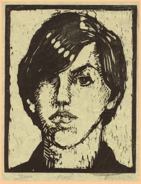 'Shane' was my first portrait in wood. I took the image
from an oil painting I had already done of him and traced it from the
canvas onto tracing paper, then onto the block. With careful cutting,
there was Shane. I did another of my son, Jeremy, and was so pleased
I drove to Kent State University (an hour's drive from here) to give
them their portraits (which they added to the...uh... 'art' on their
dorm walls).
'Shane' was my first portrait in wood. I took the image
from an oil painting I had already done of him and traced it from the
canvas onto tracing paper, then onto the block. With careful cutting,
there was Shane. I did another of my son, Jeremy, and was so pleased
I drove to Kent State University (an hour's drive from here) to give
them their portraits (which they added to the...uh... 'art' on their
dorm walls).
Unless I'm cutting a block from a subject which sits before me in the form of my model, it often takes a long time to develop a design I want to try on wood. For two weeks I might sketch the idea in every way I can imagine. When a drawing finally feels right, I trace it onto a tinted poplar woodblock (I usually use a burnt sienna colored ink for the tint). This enables me to see where I have made my cuts. I use tracing paper, carbon paper and a soft pencil to transfer the design to the wood. Then I go over the carbon paper lines on the wood with black permanent ink so I can see more clearly where to cut.
The tools I use are micro (small) tools: a V-cutter, a few U-gouges in various sizes and not much else. I like to leave gouge and cut marks in the finished block because they give the print energy. It's as if we are seeing both the wood's and the image's aura. I think of this when I make the design. I plan areas where this can happen. When I pull a print, I'm often happily surprised at how the wood has responded to my yearning to have it dance around the forms I have made. I believe the energy in a design is its most important element; it comes by itself from the wood if I let it. When that energy appears in the print within the design I created, I feel something transcendent has happened.
When I'm finished cutting, I make a few proofs to see how the design has shaped up. I roll up the wood with a brayer and a water based ink for the proof, knowing I won't be as happy with the result as when I use oil based ink. Water based inks dry out before I can finish my experiments in burnishing, but for a proof, it's a fast, clean way to check the design for progress. The paper I use for proofing is newsprint or sumi paper. Finally, when I've got what I think I want, I mix up oil based ink onto a glass and work it to that certain consistency which has a sound and a look to it: not too thick, not too meager. The roller will hiss through the ink and the 'bubbles' will evenly distribute themselves into tiny nubs. I roll the ink onto the block until I see an even sheen.
 The paper, Kitakata, has been torn in half using a
straight edge, then lightly taped with removable clear tape to a line
I have made down the left hand side of an L-shaped registration
board. (Pre-measured marks along the bottom of the registration board
have guided the placement of the bottom edge of the paper. After
taping the paper in place, I carefully lay it back onto the
registration board as if I'm turning a page. The inked and carved
block is then set into its place within the 'L' of the registration
board and the taped paper is gently lowered inch by inch from left to
right onto it. (If I do it faster, I unfortunately drop the center of
the paper onto the block in a place it doesn't belong.) I press the
paper down with my palm to help it adhere to the ink. Now I remove
the tape, then slide the block and its paper away from the
registration board so that my hand will have freedom on all sides to
burnish. I keep working with my hand until I feel every part of the
block has been pressed to the ink. I take up the wooden spoon and
start burnishing in circles from the center, out, until I see the
image appearing through the back of the paper.
The paper, Kitakata, has been torn in half using a
straight edge, then lightly taped with removable clear tape to a line
I have made down the left hand side of an L-shaped registration
board. (Pre-measured marks along the bottom of the registration board
have guided the placement of the bottom edge of the paper. After
taping the paper in place, I carefully lay it back onto the
registration board as if I'm turning a page. The inked and carved
block is then set into its place within the 'L' of the registration
board and the taped paper is gently lowered inch by inch from left to
right onto it. (If I do it faster, I unfortunately drop the center of
the paper onto the block in a place it doesn't belong.) I press the
paper down with my palm to help it adhere to the ink. Now I remove
the tape, then slide the block and its paper away from the
registration board so that my hand will have freedom on all sides to
burnish. I keep working with my hand until I feel every part of the
block has been pressed to the ink. I take up the wooden spoon and
start burnishing in circles from the center, out, until I see the
image appearing through the back of the paper.
Now it gets creative. Some areas will become deep and dark; others I want to keep as atmospheric as possible. Shadows within a white object will be kept soft by gentle burnishing. Shadows around dark objects will become even darker from heavy pressure. From time to time I will lift up an edge to take a peek at the progress, making certain I am holding the rest of the paper firmly upon the block with my other hand. You can make decisions about how far you want to go with the burnishing in order to reach the effects you want. I might try several different burnishings, making a number of prints, just to see what looks the most exciting. Shane was printed many times to achieve the one with the right transparency, coupled with emphasis.
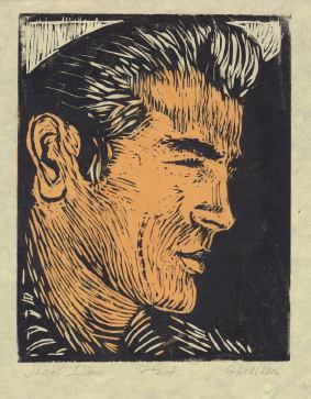
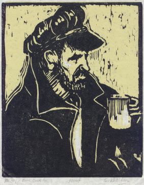 With James Dean , as well as in this print, titled
Alois, I burnished pretty evenly since the first block was a color
and I needed to emphasize the black over it. I have done a few hand
colored prints, but my designs are so worked out in black and white,
I usually can't find where color would enhance them.
With James Dean , as well as in this print, titled
Alois, I burnished pretty evenly since the first block was a color
and I needed to emphasize the black over it. I have done a few hand
colored prints, but my designs are so worked out in black and white,
I usually can't find where color would enhance them.
A development in my printmaking has been to create stamps from erasers or the end of a chopstick when I feel a need for a repetitive design somewhere within the image. And most recently, I have been trying James Mundie's dry point technique on small boards. It gives a different look to the print, one I'm enjoying for its soft, mysterious etchinglike quality. The tools are simple; a needle and a straight edged razor blade. You can take this work with you and have something to play with while you are stuck somewhere, such as waiting for someone at the doctor's office. Of course if you find yourself picking at the wood too vigorously, you might have to swab up a few little wood specks. I find a mere tissue can handle the job.
Woodblock printmaking is my joy. It has freed me from my concentration on portraits (though I still do them in a sketchbook using colored pencils on a brown thick paper). With woodcuts I can play with ideas from dreams and poems as the medium lends itself to an expressiveness unlike any other I've tried, and it's magic every time I pull a print.