Today's postings
- [Baren 40486] Re: Print exchange #43 Now that its done, where do I ... (jennifer kelly)
- [Baren 40487] Gold Pigment Possibilities (Margot Rocklen)
- [Baren 40488] Margot Rocklen's missing message re Gold Pigment (Gayle Wohlken)
- [Baren 40489] Oops (Gayle Wohlken)
- [Baren 40490] editions (Marilynn Smith)
- [Baren 40491] RE: using alternative mediums in a pinch... ("Phare-Camp")
- [Baren 40492] Re: Baren Digest (old) V50 #5112 (Hideki Arichi)
- [Baren 40493] re: Quandry Over Editions ("Ellen Shipley")
- [Baren 40494] when sharp isn't sharp enough (Andrew Stone)
- [Baren 40495] Re: when sharp isn't sharp enough (David Bull)
- [Baren 40496] Numbering prints (Jennifer Martindale)
- [Baren 40497] Baren Member blogs: Update Notification (Blog Manager)

Message 1
From: jennifer kelly
Date: Mon, 25 Jan 2010 13:30:48 GMT
Subject: [Baren 40486] Re: Print exchange #43 Now that its done, where do I ...
Send Message: To this poster
Message 2
From: Margot Rocklen
Date: Mon, 25 Jan 2010 15:05:17 GMT
Subject: [Baren 40487] Gold Pigment Possibilities
Send Message: To this poster
Viza,
when I have used metallic oil base printing inks they have sunk into my
paper and become lusterless and brown or gray. I have used Winsor &
Newton's gold-metallic bronze ink for brush or calligraphic pen, that
can be thinned w/water. It worked beautifully, and when burnished, even
better. Speedball also makes specialized calligraphic inks. Not sure if
they make the metallics. I also mixed PearlEx Brilliant Silver and Gold
Jacquard powders with methyl cellulose paste and applied it through a
stencil to my dry moku hanga prints. That worked to give a softer, more
satiny finish.
Margot Rocklen

Message 3
From: Gayle Wohlken
Date: Mon, 25 Jan 2010 16:14:04 GMT
Subject: [Baren 40488] Margot Rocklen's missing message re Gold Pigment
Send Message: To this poster
didn't appear in the digest. I apologize to all those who receive the
messages individually, as you have already seen this.
~Gayle Wohlken
> Viza, when I have used metallic oil base printing inks they have
> sunk into my paper and become lusterless and brown or gray. I have
> used Winsor & Newton's gold-metallic bronze ink for brush or
> calligraphic pen, that can be thinned w/water. It worked
> beautifully, and when burnished, even better. Speedball also makes
> specialized calligraphic inks. Not sure if they make the metallics.
> I also mixed PearlEx Brilliant Silver and Gold Jacquard powders with
> methyl cellulose paste and applied it through a stencil to my dry
> moku hanga prints. That worked to give a softer, more satiny finish.
>
> Margot Rocklen
Message 4
From: Gayle Wohlken
Date: Mon, 25 Jan 2010 16:16:41 GMT
Subject: [Baren 40489] Oops
Send Message: To this poster
~Gayle

Message 5
From: Marilynn Smith
Date: Mon, 25 Jan 2010 17:05:16 GMT
Subject: [Baren 40490] editions
Send Message: To this poster
notes and put it in my file drawer. Either way good notes are very
helpful. It is so rare for me to do this that I don't need to stack
them.
As for numbering an edition I was taught to number only the good
prints and that is the number for the edition. You destroy bad ones
and you can have a few working proofs and an artist proof and I know a
few folks also pull a printer proof. A working proof is labeled W/P,
an artist proof is labeled A/P. The funny thing about editions is
that artists vary a lot in how they handle it, so it really is not
totally consistent.
Marilynn

Message 6
From: "Phare-Camp"
Date: Mon, 25 Jan 2010 17:50:42 GMT
Subject: [Baren 40491] RE: using alternative mediums in a pinch...
Send Message: To this poster
my reply here as it's on topic and of educational value to the forum...
yes stack several folded paper towels under a large gob of paint inside a
closed tupperware or jar and let it sit overnight (putting it into a closed
container will help to prevent a skin from forming). There will still be a
bit of linseed oil left in the paint so you probably wont need to thin the
paint, but miracle gel should work fine, although burnt plate oil would be
better. BTW, burnt plate oil is just linseed oil cooked to a thicker density
- I vaguely remember long ago reading online how it was made. Its risky, if
I remember right you have to maintain the right temperature to avoid fire
and you have to stop at just the right time to avoid over cooking...
Anyway, I don't think you will want to thin the paint after it's sat
overnight. It should be just the right viscosity for printing, the only
reason to thin would be to overprint transparencies. Are you wanting to
create a gilded effect or print transparent? For gilded do a test print and
if its still too thin let it sit for another day on fresh stacked toweling.
If you want to print transparencies try a test print with the paint after
the first day, if its too dense add a dab of miricle gel and test again.
Let all the test prints sit over night and check the back to make sure
there's no bleeding! If there is any yellow leeching let the paint sit
longer on fresh toweling. Although I think that with the heat down there
the linseed oil should leech out into the toweling fairly quickly.
Oh if you decide to gesso, try using an uncarved block to roll gesso or
acrylic medium on the block then print onto the paper. This will give a
consistant thin layer that will still be flexible. I print with acrylic
paints all the time (gesso is just a watery acrylic paint). I find that
when printing with acrylics I need to keep a spray/misting bottle on hand
and occassionally quickly/lightly spritz the block the brayer and the pallet
-- you'll quickly figure out just about when everything needs a spritz --
here in dry Sacramento it's usally every two to three prints. You may also
need to do more ghosts as the quick drying acrylics tend to clog block more
often. You can also add retarder to the acrylic gesso/medium to keep it
from drying too quickly. (you will still need a spritzer)
I understand your supply plight, when I was doing my master's online my
adviser often told me of one of her students (never said any names) who
lived in Mexico. For class materials she would constantly have to
improvise/substitute or make them from scratch. She made some real leaps
and bounds in her classes when a local artist passed away and his family
"gave" her all his art materials! I suspect that the extra challenges bring
some extra fun by add a little adventure and experimentation to your arting!
Can't wait to see how you creatively adjust this time! Hope these tips help
Cheers,
Patti
PS: huhm, I have a book on making your own art materials -- I should see if
there's a recipe for burnt plate oil in it.
Message 7
From: Hideki Arichi
Date: Mon, 25 Jan 2010 21:20:18 GMT
Subject: [Baren 40492] Re: Baren Digest (old) V50 #5112
Send Message: To this poster
I was under the impression that if the plate is unaltered but the background is a different colour then that becomes another version but would be marked as such on the title or face of the print.
Not sure that the wiki definition clarifies things or not...
http://en.wikipedia.org/wiki/Edition
Message 8
From: "Ellen Shipley"
Date: Tue, 26 Jan 2010 02:38:45 GMT
Subject: [Baren 40493] re: Quandry Over Editions
Send Message: To this poster
Actually I feel better about my x/100 numbering scheme, but I see the definite advantage to keeping better notes! Especially the idea of keeping them on the back of a print. I may try that. 8-]
Thanx again,
Ellen
Message 9
From: Andrew Stone
Date: Tue, 26 Jan 2010 03:00:39 GMT
Subject: [Baren 40494] when sharp isn't sharp enough
Send Message: To this poster
I assume that I'm working them too dull and the fine stone isn't doing the trick? Also regarding the Aisuki, mine gradually seem to get less curved as I sharpen. How does one maintain the curve shape of the blade edge as a distinct process from sharpening the bevel. (Also is the bevel "flat" or curved?)
I've looked at the sharpening videos and am still confused. Or perhaps just dull.
Andrew
rospobio.blogspot.com

Message 10
From: David Bull
Date: Tue, 26 Jan 2010 03:16:47 GMT
Subject: [Baren 40495] Re: when sharp isn't sharp enough
Send Message: To this poster
> But I just bought a new aisuki and toh from McClains and as I was
> working on a block I tried them out and there was no comparison.
> These were WAY sharper than the tools I was using regularly and
> keeping "sharp".
Is this perhaps simply due to the 'good steel'? Japanese tools _are_
famous for the quality of the steel; you don't mention what you were
using before ...
> How does one maintain the curve shape of the blade edge as a
> distinct process from sharpening the bevel. (Also is the bevel
> "flat" or curved?)
It's not easy. You can't use a grooved stone, and there seems to be no
practical way to use any kind of guide. It just comes down to the way
you 'rock' the tool as you pass it over the surface.
It's tough to keep the shape consistent over time; little by little it
changes each time you sharpen, until one day you realize that 'This
thing isn't working properly anymore!'.
Even with all the years I've been doing it, this still happens to me,
and I've got some little 'guide marks' scratched into my bench top
that I use as 'templates' to try and help me 'stay in line'.
Dave
Message 11
From: Jennifer Martindale
Date: Tue, 26 Jan 2010 10:48:08 GMT
Subject: [Baren 40496] Numbering prints
Send Message: To this poster
I have followed with interest the discussion on print numbering. It seems to be a collectors aim to know the scarcity or otherwise of a bought item. If one prints only five but claim an edition of 10 is seems to me to be a lie. I prefer the technique (as followed by David Bull) of dating the print run but not numbering. I know the galleries don't like it, but in reality how often does anyone actually go back and reprint without making some change or other. I mean to but actually never have.
I like the discipline of keeping good records and thanks to all for sharing their methods. This has become my new year resolution! Jennifer
Digest Appendix
Postings made on [Baren] members' blogs
over the past 24 hours ...
Subject: Dighton Rock
Posted by: Annie B
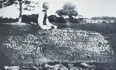 For thousands of years Native American peoples have carved symbols, signs and images on rock surfaces. The first of the New World petroglyphs to be brought to the attention of European settlers was Dighton Rock, a 40-ton quartz-sandstone boulder found on the east bank of the Taunton River in southeastern Massachusetts. Dighton Rock was first recorded in 1680 by a clergyman named John Danforth, who made a drawing of the figures and symbols and wrote a brief description of them. Since then, the rock has been studied perhaps more than any other petroglyph in North America. Over 30 theories have been advanced about the origins of the markings, including the idea that the glyphs were created by Native Americans, Phoenicians, Egyptians, Vikings, the Portuguese, and even the Chinese. 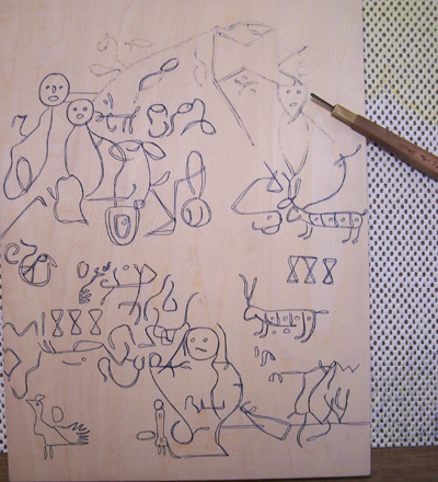 I'm going with Native Americans as the creators of the markings, and I decided to use some of the Dighton Rock symbols as models for a background under my Eliot Bible facsimile. And here's the completed text block, ready to print: [Long item has been trimmed at this point. The full blog entry can be viewed here] |
This item is taken from the blog Woodblock Dreams.
'Reply' to Baren about this item.